
Lab and field data can tell different stories. Determine when to apply these different instruments, with corresponding action for mapping, and how to fix those actions in relation to Core Web Vitals thresholds.
When it’s time to speed up your website, you’ve got plenty of helpers. PageSpeed Insights, Google Lighthouse, and GTmetrix lead the pack. However, each tool works differently, answers different questions, and returns different results. Therefore, pick the one that fits the job, whether you need a quick overview, a live browser check, or a deep dive for hidden bottlenecks. In short, learn the difference between Lab and Field data. As a result, every report you read will make far more sense.
Core Concept: Lab vs. Field Data
What the Two Data Types Mean
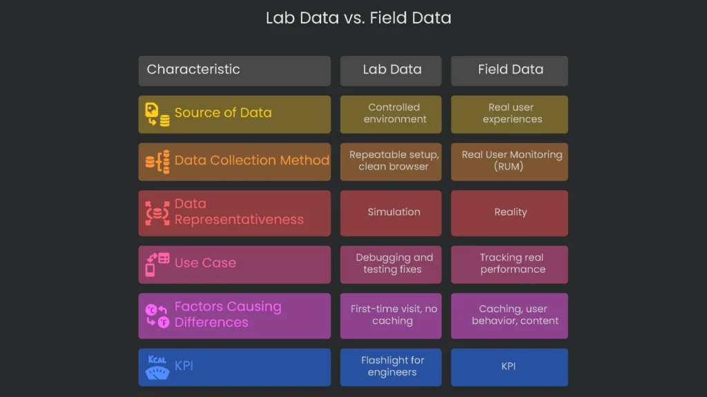
Lab data comes from a controlled, artificial environment. Lighthouse spins up a fresh browser, picks a simulated device, and runs fixed tests. Field data, by contrast, reflects what real users see on real devices and networks. Consequently, Lighthouse may show one score while GTmetrix shows another, even if the site did not change. Therefore, always note whether you are reading Lab or Field data before you decide what to do next.
Understanding Lab Data
Lab data is gathered in a tidy, repeatable setup. Testers load a page with the same device profile, network speed, location, and a clean browser. Google Lighthouse powers this process. The biggest advantage is repeatability. For example, developers can rerun the same test after each code change to confirm gains or catch regressions. As a result, lab data is ideal for debugging and proving that a fix works before it reaches users.
Understanding Field Data
Field data captures real experiences in the wild. This approach, called Real User Monitoring (RUM), collects signals from many devices, networks, locations, and browser setups. Most of this comes from Google’s Chrome User Experience Report. Because it reflects reality, it is more representative than a simulation. Moreover, Google consults this data when weighing page experience for SEO. Therefore, you should track it closely.
Why Lab and Field Data Differ
Lab tests and real user data often disagree, and that is normal. A lab test might rate a page 98. However, field data could still look “Poor.” The gap usually comes from a few factors.
- Caching: Lab tests assume a first-time visit with no saved files. In the field, many visitors already cache logos, fonts, and small assets. As a result, return visits feel faster.
- User Behavior: Labs time the first load, then stop. Field data tracks scrolling, tapping, and layout changes. For example, the cumulative layout shift metric can spike during real interactions, while a single lab run might miss it.
- Content Differences: Labs see a plain, logged-out view. Real users may be logged in, shopping, or seeing targeted ads. Consequently, their sessions pull extra data and add time.
- Data Delay: Tools like PageSpeed Insights report a 28-day rolling window. Therefore, today’s fix appears gradually as new data replaces old results.
Do not chase a flawless lab score. A perfect 100 on a developer’s fast machine does not guarantee happier users. Instead, use lab scores as a roadmap. Ultimately, improving field metrics is the goal.
Data’s Role in Business
Field data is your KPI. It reflects real performance, sales impact, and SEO outcomes. Lab data is your flashlight. It helps engineers find issues, test fixes, and confirm improvements before release. Together, they keep your site fast and stable.
PageSpeed Insights (PSI)
Key Feature: Unified View of Data
PageSpeed Insights is the best free starting point for a performance snapshot. It shows real-user data and lab data in one clear report. Consequently, you get faster insights than with separate tools.
The Real-World Perspective
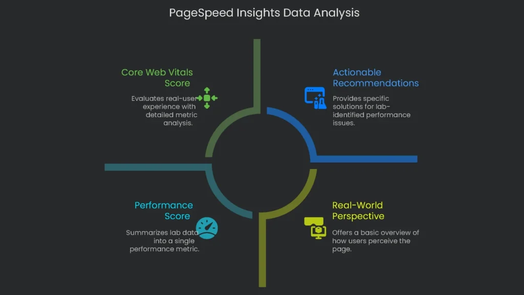
The most useful section appears at the top: “Get an up-close look at what real users see.” This view reveals how visitors experience your page and how Google assesses it for rankings.
- Data Source: PSI pulls from the Chrome User Experience Report (CrUX). It presents a 28-day summary of real Chrome sessions.
- Core Web Vitals Score: The report checks the three Core Web Vitals and shows “Passed” or “Failed.”
Largest Contentful Paint (LCP), Interaction to Next Paint (INP), and Cumulative Layout Shift (CLS) are the three metrics. A page passes if at least 75% of users have a “Good” experience across all three. Therefore, most visitors should enjoy a smooth visit.
- Swap Between URL or Origin Views: Choose to see a single page or the whole origin. This flips you from a close-up URL view to a broader domain view. Consequently, you can spot whether one page drags down the site or the reverse.
The On-Demand Check
Below the real-user section, you can run a lab test on demand. This quick Lighthouse run uses Google’s own servers.
- Performance Score: A single number from 0 to 100 summarizes performance. It weights LCP, Total Blocking Time, CLS, the First Contentful Paint, and Speed Index.
- Actionable Recommendations: “Opportunities” and “Diagnostics” list specific issues. For example, you may see “Eliminate render-blocking resources,” along with estimated milliseconds saved.
Best Use: Reporting and Tracking
Since PSI includes real CrUX data, it is ideal for reporting and long-term tracking. The “Passed” or “Failed” label gives a clear health signal. Use it for monthly or quarterly reviews. However, remember the lag. The 28-day window reflects the recent past, not today. Therefore, schedule regular lab tests to catch fresh issues quickly. Also, the “Origin” view can mask problems on critical pages, such as carts. As a result, always check key URLs individually and not only the origin average.
Lighthouse for Developers
Key Feature: Local Testing
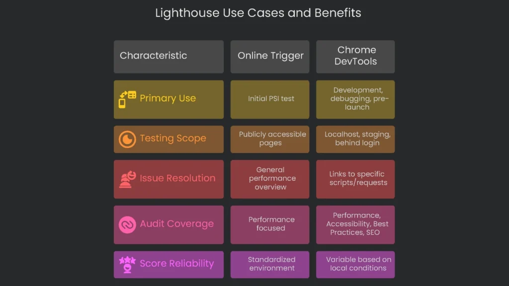
Google Lighthouse powers PSI’s lab tests, but it is also an open-source tool you can run yourself. PSI offers a handy online trigger. However, the real magic appears when you run Lighthouse in Chrome DevTools.
The Developer’s Workspace
Lighthouse fits naturally into day-to-day development. Better yet, it can test pages that the public cannot reach, such as localhost, staging servers, or areas behind a login. Consequently, teams can add performance checks from day one and catch issues early.
- More Than Just Speed: A full Lighthouse audit covers Performance, Accessibility, Best Practices, and SEO. Therefore, it checks overall page quality, not only speed.
- Clearer Fixes: Running Lighthouse inside DevTools links issues to specific scripts or requests. As a result, you can fix the right file without guesswork.
Best Use: Squashing Bugs & Last-Minute Checks
Lighthouse shines during development and pre-launch. A developer can adjust code, run a local audit, and see results instantly. Many teams add Lighthouse to automated tests to enforce speed budgets. Meanwhile, do not worry if local scores differ from PSI. PSI runs with fixed server and network profiles via Lantern. Local runs vary with your hardware, network, open tabs, and extensions. Therefore, track relative improvement, not a perfect match.
Do not ignore non-speed audits. For example, adding width and height to images improves accessibility and reduces layout shifts. That change boosts your Cumulative Layout Shift score and makes pages feel steadier. Consequently, best practices often speed things up too.
GTmetrix for Analysis
Key Feature: The Waterfall Chart
GTmetrix is a favorite for deep analysis. It now uses Lighthouse under the hood, yet adds powerful diagnostics. The waterfall chart is its crown jewel. It breaks the load into every request and shows exactly why something is slow.
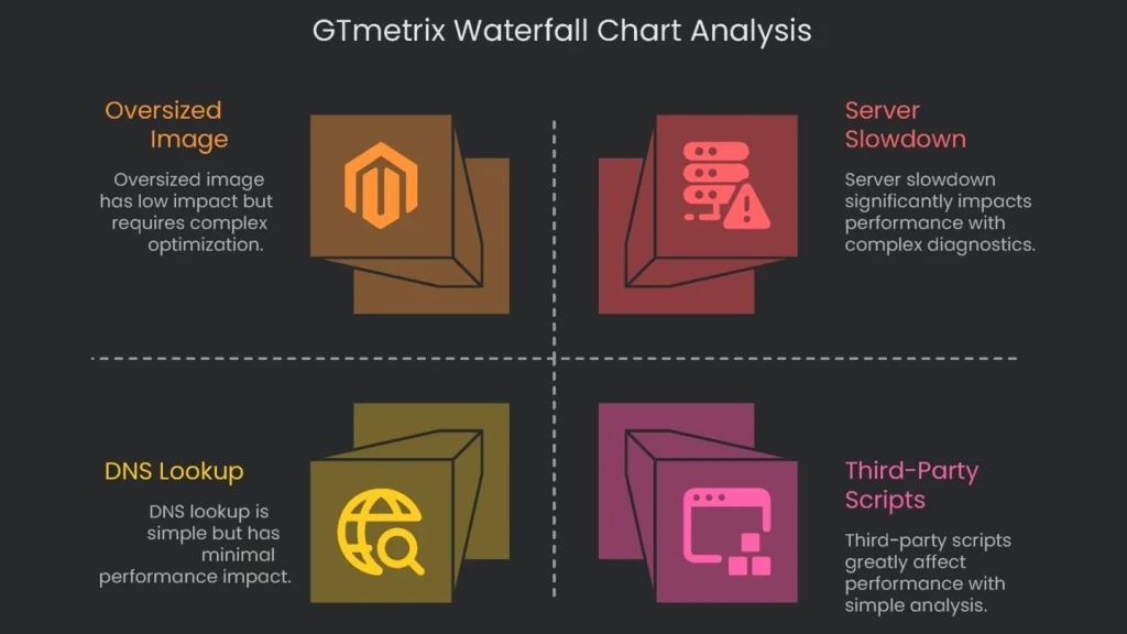
- Visualizing the Load: Each request—HTML, CSS, scripts, and lazy-loaded images—appears on a timeline. You can see when it started, how long it took, and when it finished.
- Understanding the Waterfall: Each bar reports the URL, status code, size, and timing. The timeline segments show Blocking, DNS Lookup, Connecting, Waiting (also called TTFB), and Receiving. Consequently, you can pinpoint whether the server, the network, or the asset itself is to blame.
Seeing these bars side by side makes issues obvious. A large Waiting time on the main document suggests server slowness. A chunky Receiving segment on a logo hints at an oversized image.
- Confirming Server Slowdown: The waterfall verifies advice with hard numbers. If a tool warns “Your server is slow,” the Waiting time shows the exact delay in milliseconds.
Advanced Testing Options
GTmetrix lets you tailor tests to your audience. Therefore, you can mirror real conditions and get more reliable results.
- Test Location: Choose from many global servers. For example, test from Tokyo to see how it feels for users in Japan.
- Internet Speeds: Emulate connections from slow 3G to fast fiber. Consequently, you can judge performance for all segments.
- Device Matching: Paid plans let you model specific phones, such as a recent iPhone or a popular Android. As a result, tests reflect real hardware.
Best Job: Deep Digs
GTmetrix is ideal after PSI or Lighthouse hint at a broader issue. Next, use the waterfall to expose the exact requests that hurt performance. It is especially useful for third-party scripts. When PSI says “Reduce third-party code,” GTmetrix lists every external request for ads, analytics, or widgets, with clear timings. Consequently, teams can weigh the true cost of each asset before deployment.
Moreover, you can tune tests for your audience. If most visitors use mobile in Southeast Asia, run from Singapore with a 3G profile and a mid-range Android. That lab test will feel realistic and align with the data you see in the wild.
Conclusion: One Continuous Flow
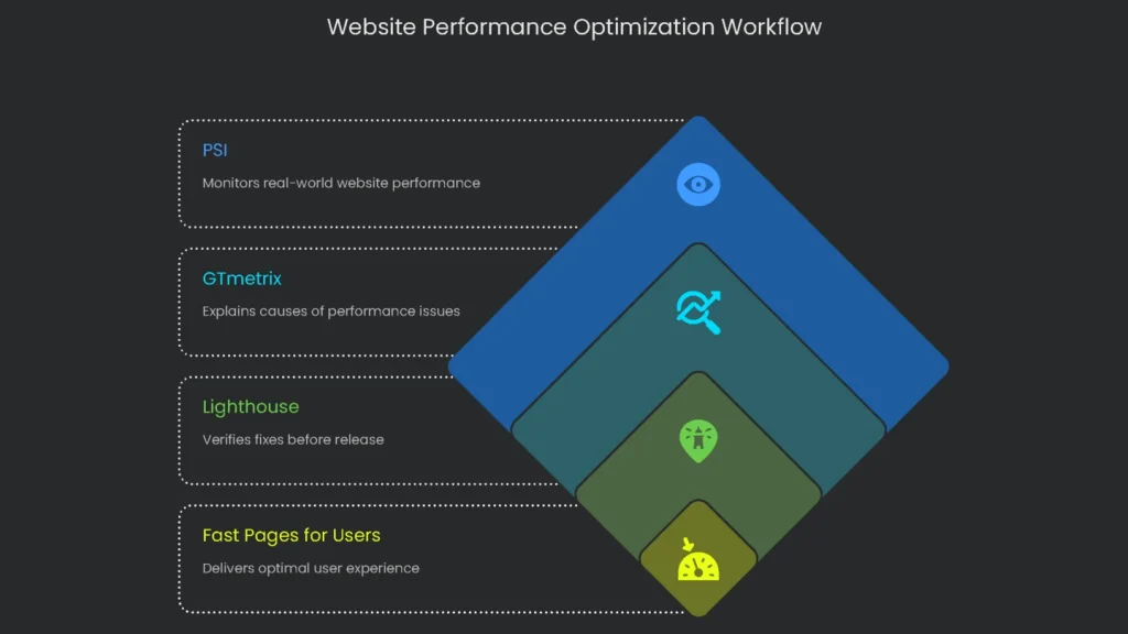
How the Tools Work Together
Arguing over a single “best” tool misses the point. These tools are teammates in one workflow. PSI monitors reality, GTmetrix explains causes, and Lighthouse verifies fixes before release. Finally, blend all three to deliver pages that feel fast for real users.
Rapid Comparison
At-a-Glance Table
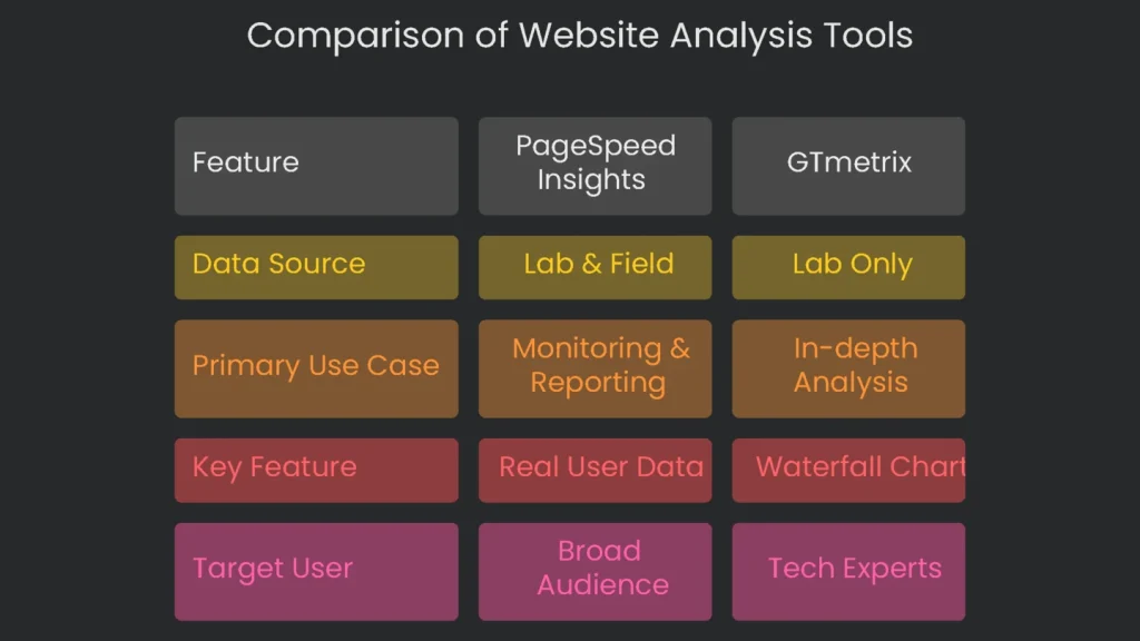
| Feature | PageSpeed Insights (PSI) | Google Lighthouse | GTmetrix |
| Data Source(s) | Lab (Lighthouse) & Field (CrUX) | Lab Only | Lab (Lighthouse) with advanced diagnostics |
| Primary Use Case | Monitoring and reporting to your (QA) team. | Debugging and testing during development. | In-depth (cause) analysis to find specific problems. |
| Key Feature | Pulls together real user (Field) data with speedy Lab data you can grab anytime. | Runs live in DevTools, scanning Performance, SEO, Accessibility, and Best Practices. | Creates a detailed Waterfall Chart that lays out every single network request. |
| Target User | SEOs, marketers, product owners, and anyone running a site. | Developers, technical SEOs, and QA testers. | Performance engineers, developers, and anyone tackling technical SEO. |
A Smooth Professional Workflow
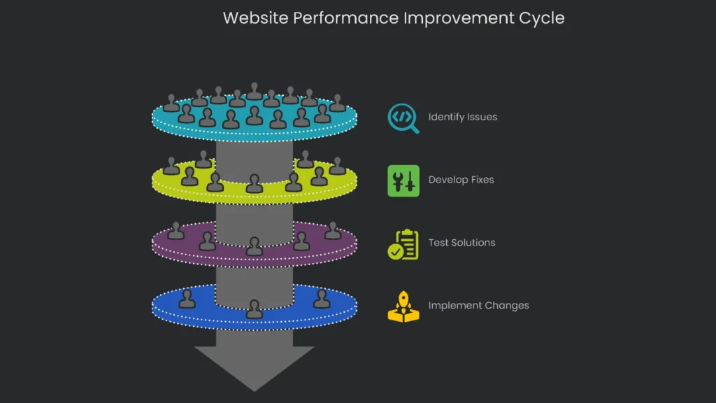
A winning improvement cycle uses each tool in the right order and plays to its strengths.
Monitor with PageSpeed Insights
Let PageSpeed Insights be your main performance dashboard. Open the Field Data for your most crucial pages at least weekly. That data gives the “State of the Union” for Core Web Vitals. Next, review the 28-day trends to see whether performance is rising or slipping. This is the number to share with your team and to guide strategy.
Dig Deeper with GTmetrix
When PSI flags a page as “Needs Improvement” or “Poor,” investigate. Drop the URL into GTmetrix and switch the question from “What’s slow?” to “Why is it slow?” Then study the waterfall. Pinpoint heavy images, slow requests, or blocking scripts. Therefore, you can confirm whether the issue is server lag, a poorly optimized image, or a front-end script that needs a smarter load order.
Fix and Test with Lighthouse
After GTmetrix spots the culprits, prepare fixes on a local or staging site. Lighthouse in Chrome DevTools becomes your Swiss-Army tool. As you resize images, compress files, or defer scripts, click “Run audit” to see results instantly. Consequently, the team can tweak in real time without shipping slow code.
Start Again
When Lighthouse gives the thumbs-up and changes go live, loop back. A lab tool shows quick results, but the final judge is Field Data in PSI. Watch the CrUX stats for 28 days to confirm a real-world lift. Finally, repeat the cycle. You will steer improvements by real user experience, not by vanity scores.
Implementation steps
- Archive field data (like CrUX/PSI) for live performance numbers on priority pages.
- Launch Lighthouse for side-by-side lab checks, spotting the biggest drag-by each metric.
- Dive into GTmetrix/WebPageTest detailed waterfalls to dissect the request pipeline.
- Rank action items (like images, blocking CSS/JS, and TTFB) and assign page owners.
- Remap, retest, and watch field metrics for patterns after each code drop
Frequently Asked Questions
Why do the numbers look different?
Each score pulls from unique data sets, devices, and throttling limits.
Which score do I follow for ranking?
Trust the field data from CrUX in PSI/GSC for real users; use lab data for troubleshooting.
What do I check first?
Focus on the Core Web Vitals: LCP, INP, and CLS.
Why do my local tests look quicker?
Local tests often skip mobile throttling and run from a closer server.
How do I line up the numbers?
Treat the field data as the baseline; use lab tests to find and fix issues.