
On mobile devices, Google only views your Google’s desktop version. Maintain content parallelism, deploy lazy loading, configure tap targets appropriately for the user, and maintain a mobile layout structure for responsive user experience.
If you pay attention to getting your website noticed on Google, you’ve probably heard about mobile-first indexing. It’s one of the biggest updates in the SEO world, and it’s here to stay. Therefore, grab this guide to see what the shift really means, how to check if your site’s ready, and what moves to make so you don’t fall behind.
What Is Mobile-First Indexing?
Put simply, mobile-first indexing means Google looks at the mobile version of your site before the desktop one when deciding how to list it on search results. For example, Google sends out a bot—basically a robot that acts like a smartphone—to browse web pages. It checks your mobile layout, speed, and content. Consequently, Google saves that info in one big library and uses it to rank your pages.
However, many people think Google keeps two separate library lists, one for mobile and one for desktop. That’s a myth. In short, Google has one big library. The update simply means the mobile version is now the front page that Google uses for that library.
Why Google Made the Switch
Google made mobile the main focus for search results because the way people search changed. Back in 2015, more people were using phones instead of computers for queries, and that percentage has only gone up. As a result, Google sticks to its core mission: make the online experience better for everyone. When it evaluates the mobile version of a page, it ensures the results link to what most visitors will actually see.
Mobile-First Is Now Mandatory
Mobile-first indexing is no longer a guideline known only to experts; it is the only way for search to work. Any new website that launched on or after July 1, 2019, automatically had mobile-first indexing applied at birth, no exceptions. Moreover, older sites no longer have a grace period. Google set a hard cutoff: after July 5, 2024, any website pages that can’t be read on mobile will vanish from Google’s results. Therefore, if your page isn’t built for phones, it will no longer appear in Google’s search results.
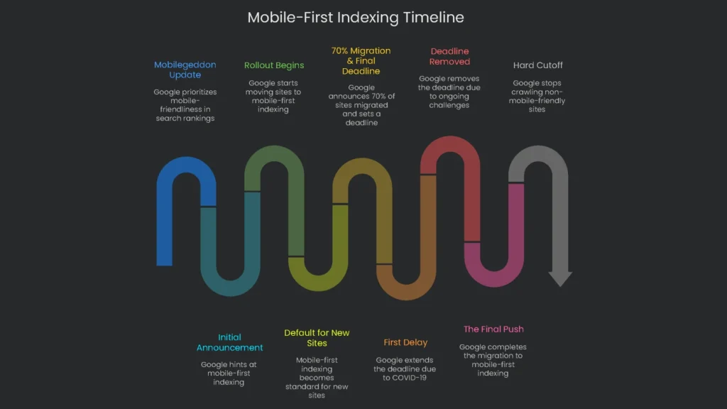
A Glimpse Back in Time
When you know the backstory of mobile-first indexing, you can see why it matters. The shift wasn’t a snap decision; it rolled out piece by piece, revealing the hurdles many sites had in going truly mobile. This history shows that a “bare minimum” mobile page usually isn’t enough for Google’s technical rules. Consequently, the slow rollout, dotted with pauses and speed bumps, proved that many sites weren’t ready for firm mobile-first rules. Google’s data even showed that lots of sites ran into “surprising hurdles” when matching mobile and desktop content.
| Date | Milestone | Why It Matters |
| April 2015 | “Mobilegeddon” Update | Google made mobile-friendliness a score that counted in mobile search, a wake-up call that the mobile experience had to come first. |
| November 2016 | Initial Announcement | Google teased that it was practicing with mobile-first indexing, the first sign of a bigger plan. |
| March 2018 | Rollout Begins | Google officially began moving sites that followed the best practices to mobile-first indexing. |
| July 2019 | Default for New Sites | Mobile-first indexing automatically kicked in for all new sites, stamping it as the new norm for the web. |
| March 2020 | 70% Migration & Final Deadline | Google announced that 70% of sites were already indexed for mobile-first, and told everyone that the last chance to catch up was September 2020. |
| July 2020 | First Delay | Because of how the COVID-19 pandemic was affecting the whole world, Google extended the deadline to March 2021. |
| November 2021 | Deadline Removed | Google took the March 2021 cutoff away, saying many sites were still working through “unexpected challenges.” |
| May 2023 | The Final Push | The migration was wrapped up, and the last batch of sites switched to mobile-first indexing. |
| July 5, 2024 | Hard Cutoff | Starting on that date, Google will not crawl sites that aren’t mobile-friendly, no exceptions. |
Check Your Site’s Status
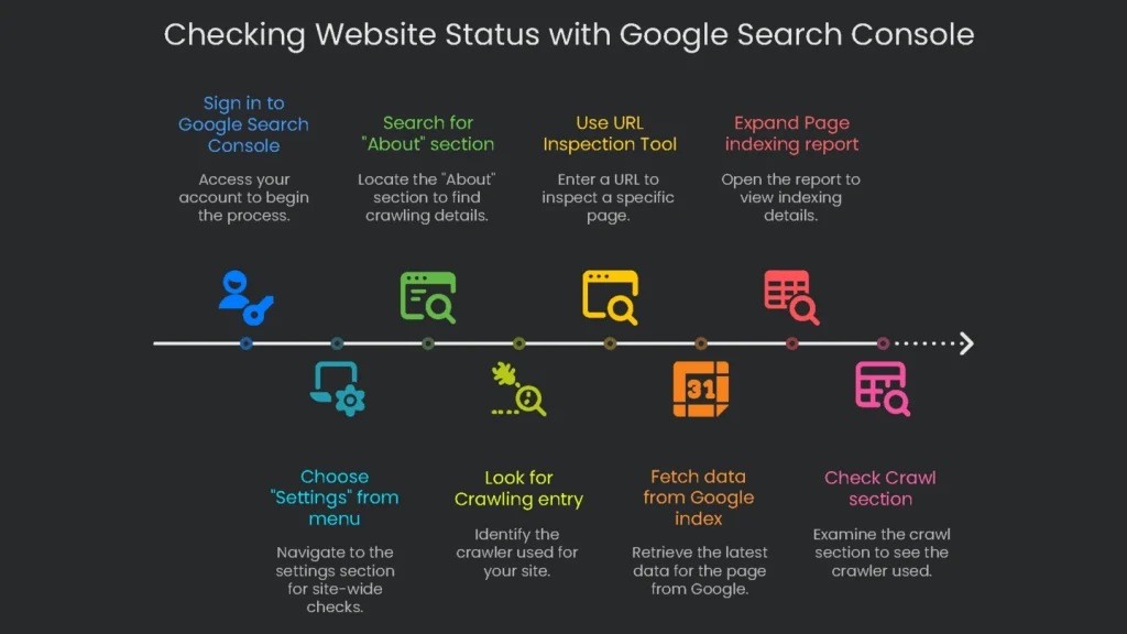
First, find out the current state of your website before changing anything. The Google Search Console offers two tools: one for the whole site and another for checking each page.
Check in “Settings”
This approach reveals whether your complete site has switched to mobile-first indexing.
- Sign in to your Google Search Console account.
- Choose “Settings” from the menu on the left.
- Search the main panel for the “About” section.
- Look for the Crawling entry. This tells you the main crawler for your site, either “Googlebot smartphone” or “Googlebot desktop.”
- If Google just switched from one to the other, you’ll see the date the change took place, too.
Use the URL Inspection Tool
Next, use the Inspection Tool to see how Google crawled a specific page. This is handy for finding page-by-page problems.
- At the top of every Search Console page, type the full URL of the page you want to check into the search box and press Enter.
- The tool will fetch data straight from the Google index. On the results page, expand the Page indexing report.
- In that report, look for the Crawl section. The “Crawled as” label tells you which crawler was used for the last crawl (like Googlebot smartphone), and it shows the date of that crawl.
In short, both methods are useful for different reasons. The Settings check gives the overall site view, while the URL Inspection Tool helps you troubleshoot a single page—like finding a robots.txt rule that blocks the mobile crawler.
Key Optimization Principles
For mobile-first indexing to work, your whole website has to fit together like a well-crafted puzzle. Therefore, use these five rules as the border pieces that guide every technical decision you make.
Use Responsive Web Design
You have three choices when you want to make your site friendly to mobile screens:
- Responsive Web Design (RWD): Stick with a single URL and HTML document. Use clever CSS to rearrange images, text, and buttons whenever the viewport changes size.
- Dynamic Serving: Use one URL, but swap HTML and CSS for desktops, tablets, and phones on your server’s command.
- Separate URLs: Build a second site, typically on a “m.” subdomain, and serve that to phones.
Google can crawl any method, but search engineers often point to RWD as the safest. Therefore, one URL tells the same story to robots and users, which reduces duplicate flags or random ranking drops from mismatched site pairs. Simpler URL sharing also trims maintenance distractions and can give SEO a lift. In short, favor RWD and let the other systems keep their bugs.
Keep Content the Same
The biggest rule for mobile-first indexing is that every piece of content should match. Everything on the mobile site needs to mirror the desktop site. If you leave out any text, image, or video on the mobile version, Google won’t see it, so that content won’t help your rankings. Consequently, launching a “lite” mobile site with less content will now hurt your search results.
This rule covers every kind of content:
- Text: Every article, product description, and user review must show up on the mobile site just like on the desktop version.
- Images & Videos: All visuals must be present and also optimized. For example, use high-quality images, and keep the alt text and other details identical on both versions.
- Internal Links: Header menus, footer links, and other links have to match. Missing links on mobile may block Google from reaching important pages.
However, using widgets like accordions or slide-out tabs is fine if they keep things tidy. Just don’t hide key info behind a “load more” link that visitors must tap. Google’s crawler doesn’t tap or swipe; if the info isn’t in the original page code, it probably won’t get indexed.
Keep All Metadata in Sync
Just like the on-page content, the behind-the-scenes data that helps search engines needs to match. That means the same metadata and structured data should appear on both desktop and mobile.
- Metadata: Title tags, meta descriptions, and robots meta tags must be identical. A common mistake is adding a
noindextag only to the mobile version, which would remove the page from Google’s index. - Structured Data (Schema Markup): Keep all schema—like Product or Article—on the mobile version, too. Otherwise, you may miss out on rich search results, such as star ratings or quick answers. Also, confirm that any URLs inside the schema point to mobile pages, not desktop ones.
Make Your Mobile Pages Zoom
Since Google bases its judgment on the mobile side of your site, the speed of that version affects your rank. Consequently, mobile speed is a ranking signal, assessed using Core Web Vitals, a trio of metrics. If your desktop is a cheetah but your phone is a tortoise, Google will notice the lag.
Look at Core Web Vitals now:
- Largest Contentful Paint (LCP): Tracks when the biggest part of your page is visible. Aim for a low time.
- Interaction to Next Paint (INP): Records how fast the site reacts when someone taps a button. A low score keeps users happy.
- Cumulative Layout Shift (CLS): Counts how much the pieces on your page jump around. A low, stable score keeps surprises to a minimum.
Finally, check these numbers with tools like Google’s PageSpeed Insights. For real users, also review the Core Web Vitals report in Google Search Console.
Make Mobile a Breeze
Quick pages matter, but a great mobile experience goes beyond speed. If your buttons are tiny or the text is microscopic, visitors will bounce. Consequently, those fast exits can send signals to Google and nudge rankings down.
Want your mobile site to shine? Keep these four rules in mind:
- Legible Font: Pick text that’s big enough so readers can see what’s important without pinching and zooming.
- Tap-Friendly Buttons: Design tappable spots large enough for thumbs to hit comfortably, and avoid tiny links that frustrate everyone.
- Stay Vertical: Set up your layout so users only need to scroll up and down. No one enjoys swiping left and right on a tiny screen.
- User-Friendly Navigation: Build a clear, simple menu—like a clean hamburger icon—so thumbs can zip around. Also, skip pop-ups that need mouse hovers; mobile users don’t have them.
Your Go-To Mobile SEO Checklist
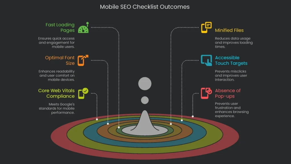
Grab this handy list and check your site step-by-step to make sure it’s mobile-ready.
Performance & User Experience
- [ ] Do key mobile pages load within 3 seconds on 4G speeds?
- [ ] Are JavaScript and CSS files properly minified and deferred on mobile?
- [ ] Is the first meaningful paint reaching users without excessive inline ads?
- [ ] Is font size large enough on viewport load, without requiring users to pinch-to-zoom?
- [ ] Are touch targets at least 48×48 pixels and spaced far enough apart to prevent misclicks?
- [ ] Have you run Google’s PageSpeed Insights check on important pages to catch slow-loading mobile elements?
- [ ] Does Google Search Console show that the Core Web Vitals report for mobile is a go?
- [ ] On mobile pages, is the font big enough to read comfortably (minimum 16px)?
- [ ] Are buttons and links 48px minimum, well-centered, and spaced enough to tap without a mistake?
- [ ] Are pesky, hard-to-close pop-ups absent so visitors don’t get frustrated on mobile?
Conclusion: Mobile SEO IS SEO
Why It Matters
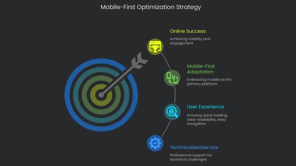
Google is now fully mobile-first, so treat mobile optimization as everyday work, not an extra chore. Therefore, the only practical approach is to think and act mobile-first. That’s how real people browse the web all day. In short, adapting to mobile-first means serving visitors what they want: pages that load quickly, read clearly, and navigate easily. Consistent content, flexible design, and speedy mobile pages are the new baseline for showing up and winning online.
Get Help From TechnicalseoService
Understanding the nuts and bolts of mobile-first indexing can feel like solving a tricky puzzle. That’s why the team at TechnicalseoService dives into the code and infrastructure of your site like detectives, uncovering hidden problems and repairing them. Consequently, we tune and polish your website so it’s fully prepared to shine under the mobile-first spotlight.
Implementation steps
- Cross a view between mobile and desktop—confirm metadata, content, and schema match.
- Tweak mobile loading so key content hits the DOM without waiting for taps.
- Lift mobile Core Web Vitals (LCP, INP, CLS) by smart image delivery plus trimmed JS.
- Whitelist key files in robots.txt so the smartphone crawler can fetch everything.
- Confirm URL Inspection (smartphone agent) in GSC and cross-check field data
Frequently Asked Questions
What is mobile-first indexing?
Google now uses the mobile version of your site as the main version for crawling and rankings.
What must match desktop?
All content, structured data, and the key meta tags must match.
Any pitfalls to avoid?
Don’t hide content behind clicks or block resources on mobile—keep it open and visible.
Does speed matter?
Absolutely—slow Core Web Vitals on mobile can hurt both rank and visits.
How do I double-check?
Pull up GSC’s mobile crawler, run the URL, and compare what you see.