
After those steps, you remain with responsive webpage, the client hosted with images in WebP and AVIF formats.
Why You Can’t Ignore Image Optimization
Pictures speed up a website. However, behind the scenes, they’re also the biggest files and usually take up half or more of the page size.
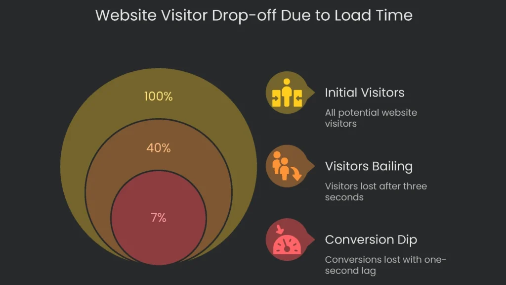
So what’s the size of the problem? A page stuffed with oversized pics can make a site feel sticky. It can push load time past the dreaded three-second mark. At that point, 40% of visitors simply bail. Add a one-second lag and conversions can dip by 7%. Therefore, fixing these file woes is no longer optional; it’s a must for any shop with an online door. In short, you get double credit with one simple fix. Shrinking image size speeds the page and makes search engines smile.
Quick-Loading Pages (The User Uplift & the Core Web Vitals Boost)
Google tracks load speed, and photos are usually the biggest speed compromise. Consequently, a site that zips feels nearly instant, and that’s pure delight for users.
- Efficient Image Delivery Shines at LCP: Image size is the magic lever. Since the largest visible item is often an image, packing it small and ready to load improves the page’s LCP score. As a result, LCP can jump by 70%, which is a huge morale booster for both visitors and Google.
- Cumulative Layout Shift (CLS): Think of CLS like a scoreboard for page comfort. If stuff on the page shifts while it loads, that jumpy feeling annoys people. Therefore, set sizes for loose images. When dimensions are missing, images pop in and push everything around, which is a straight-up CLS enemy.
- Interaction to Next Paint (INP): INP measures how quickly a site reacts the moment you tap. If big images hog processing, the browser takes a breather and clicks feel frozen. Consequently, taming oversized images makes the page flow like a good beat.
Search Engine Optimization (SEO & Visibility)
Speed is sweet. However, when visuals are on point, organic traffic can arrive like a surprise delivery on pizza night.
- Ranking in Google Images: Fun fact: over 22% of all searches happen in Google Images. If your pictures are tagged right, you’re in a bonus round. Properly sized and labeled images can land you on that carousel. Therefore, the traffic that pours in feels like free extra toppings.
- Contextual Relevance: Images need personality. When filenames and alt tags describe their story, search engines place the picture in your page’s script. As a result, your whole page shouts the right topic to the right audience.
- The Page Experience Signal: Google isn’t just judging how pretty your site is. It’s watching how quickly it serves people.
Page Experience rides on Core Web Vitals. Therefore, a smooth CLS or INP bumps that score up. Clean your images and your rank gets a boost—smooth traffic in and smooth rank out.
Handling image speed and labels separately wastes time. A picture that loads slowly yet has the perfect description is still annoying. Likewise, a speedy photo named IMG_1234 is a missed chance. This guide offers a checklist that sharpens both the tech and the words.
Prepare Images Before Upload
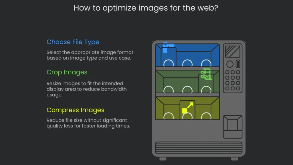
Most worthwhile optimizing happens before you upload. Build the right pre-upload checklist and you’ll wipe out common problems before they appear.
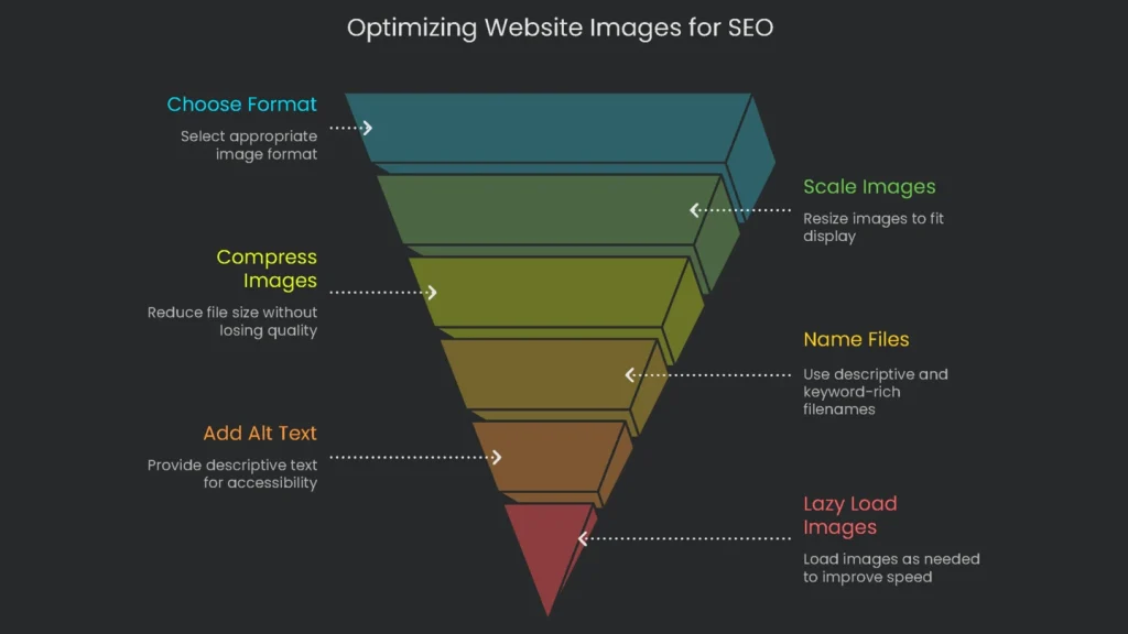
Choose the Right File Type
Selecting the best file type carries the most weight. Your choice flows from whether your picture is raster or vector.
Raster and Vector Images
- Raster Images (JPEG, PNG, WebP, AVIF): A raster image is a grid of tiny colored squares. These formats suit photos best, since they capture subtle color shifts and detail. However, if you expand a raster image past its original size, the squares show and the picture blurs.
- Vector Images (SVG): These drawings use math rather than pixels. Therefore, you can scale them to any size and they stay crystal clear. That’s why they’re great for logos and icons. However, skip them for photos.
A Quick Look at Image Types for the Web
- JPEG (Joint Photographic Experts Group): The go-to format for camera shots. It shrinks file size by tossing out data most people won’t notice. You still see most color and detail, but quality drops if you resave too many times. It can’t show transparency.
- PNG (Portable Network Graphics): The champ for images that need a clear hole or transparent edges. It preserves every detail so backgrounds can show or disappear. The trade-off is heavier files, especially for photos.
- SVG (Scalable Vector Graphics): Logos are tiny and stay sharp thanks to math. Leave photos to other formats, though, because SVG isn’t built for rich, photo-like detail. See SVG basics.
- WebP: A clever format invented by Google. It makes files smaller than JPEG while showing true color, and it supports transparency like PNG. Most websites now use it and every new browser can read it.
- AVIF (AV1 Image File Format): A cutting-edge format that creates very small images while keeping detail strong. AVIF also supports transparency and wide color and works in every major browser.
To nail performance, go for the latest. Lead with AVIF, then fall back to WebP if needed. The <picture> element in HTML lets you stack formats. Consequently, the browser grabs the one it handles best, loading the quickest possible version. That means most users zoom past image loads, while rare old browsers still see something that works.
| Use Case | Recommended Format | Secondary Choice | Avoid |
| Photo (product, hero) | AVIF | WebP | PNG, BMP |
| Graphic with Transparency | PNG | WebP | JPEG |
| Logo / Icon (simple) | SVG | N/A | JPEG, PNG |
| Detailed Illustration | PNG | WebP | JPEG |
| Animation | Video |
Crop Images to the Right Size
Nobody likes waiting for a 4,000-pixel photo to fill a 600-pixel spot. That waste saddles your site with extra bandwidth. In short, it’s like sending a semi truck to carry a bag of groceries.
Find the Perfect Size
Right-click to check a page’s setup. Head to the page where the photo will go. Right-click the placeholder and hit “Inspect.” Then mouse over the image code. A tooltip shows the needed size, like 800px × 533px. Crop to that size before uploading and you’ll trim excess baggage.
Sizing for High-Resolution “Retina” Displays
If you want clear photos on fancy screens, save them at 1.5 to 2 times the displayed size. For an 800-pixel area, pick an image 1200 to 1600 pixels wide. Compression will then shrink the file without killing quality. As a result, it loads fast and stays sharp.
Easy Resizing Tools
You don’t need pricey software. Free tools like GIMP let you resize and edit at home, and sites like Canva do it online in a few clicks.
| Website Element | Recommended Width (for desktop) | Common Aspect Ratio |
| Full-Width Hero Image | 1920 px | 16:9 |
| Blog Post Content Image | 800 – 1200 px | 3:2 or 4:3 |
| E-commerce Product Image | 1000 – 1500 px | 1:1 |
| Thumbnail | 300 – 400 px | 1:1 |
Compress Images to Reduce File Size
Once you resize, make files even smaller with compression. This step tidies the data so images take less space and load faster for everyone.
Lossy vs. Lossless Compression
- Lossy Compression: This technique shrinks files by tossing tiny details your eye overlooks. That’s why you see it in JPEG, WebP, and AVIF. You choose how much to discard, so you can balance size and quality.
- Lossless Compression: This method cuts size but keeps every pixel intact. It strips junk metadata and packs data smartly. PNG and SVG use this technique.
For most websites, lossy compression wins. Smart algorithms can slash file sizes while looking nearly the same. Consequently, pages load faster and bandwidth drops.
User-Friendly Compression Tools
Want to compress images without fuss? Try these handy tools:
- Squoosh.app: This free, browser-based app from Google packs a punch. Load your image and slide a bar to compare original and compressed versions in real time. You can choose lossy formats like WebP and AVIF or pick from many others. Therefore, you always find the size-to-quality sweet spot.
- TINYPNG / TINYJPG: This online tool is a favorite because it’s fast and free. Just drag your picture onto the page, and it zaps the file size—often by more than 70%—without visible quality loss.
WordPress Auto Tools
WordPress users can go even easier. Plugins such as these image optimizers and Smush Pro squash photos as soon as you upload. They convert to modern types like WebP and AVIF and can tidy older images already in your library. As a result, your whole media section becomes lean in a single scan.
Always remember: resize, then compress. Shrinking dimensions first cuts the most weight. The compressor then fine-tunes the remaining pixels. Consequently, you get the smallest file that still looks good.
On-Page SEO for Discoverability
Once the photo is the right size, upload it in a smart way so people and search engines can find it. Follow these steps to put your picture to work.
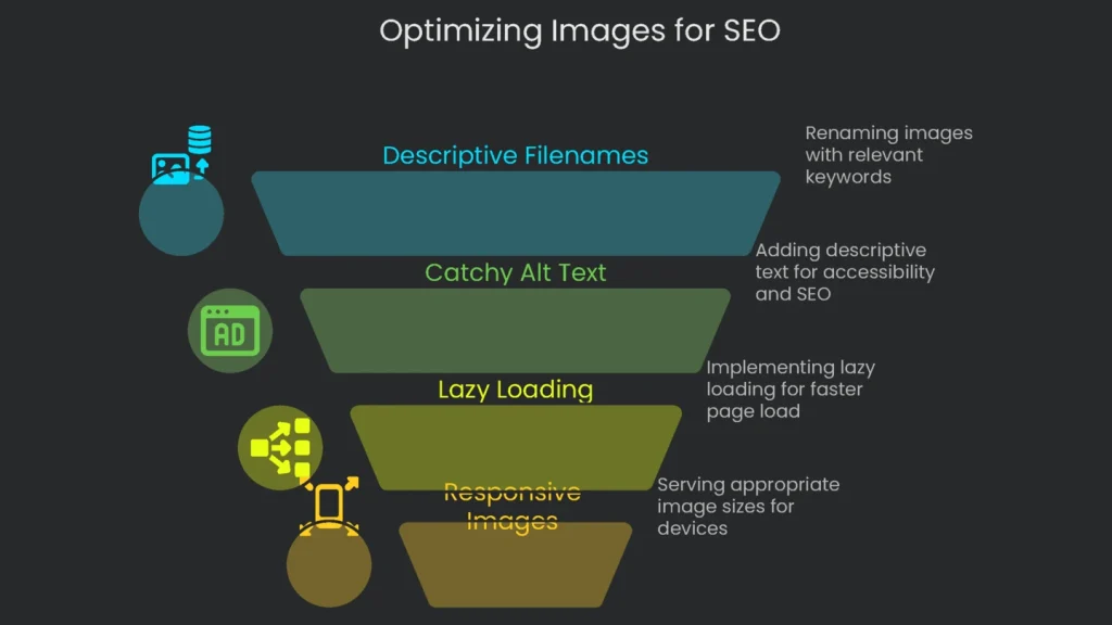
Use Descriptive Filenames
The filename tells search engines what your picture shows. Google has said it clearly: a helpful file name guides crawling robots as they scan images. Therefore, don’t leave a name like IMG_7890.jpg. Instead, rename it to something like golden-retriever-playing-fetch.jpg and let that keyword work for you.
Best Practices for Naming Files:
- Be Descriptive: Use 3–5 clear words that tell what the image shows. Skip wacky titles.
- Use Hyphens: Hyphens (-) separate words for search engines. Say no to underscores (_).
- Slide in Keywords: If the keyword fits naturally, add it. Don’t cram awkward terms.
Examples:
- Bad: cat.jpg, 2023 TRIP 001.webp, office-at-sunset.avif
- Good: fluffy-orange-cat-snoozing.jpg, new-york-office-sunset.webp, installing-free-wp-plugin.avif
Write Catchy Alt Text
Alt text is a tiny tag that does two big things. The filename talks to the server, and the alt talks to the user.
- Accessibility: This short note tells blind users what the image shows. A screen reader reads it like a narrated tour.
- SEO: It tells search engines what’s up, helping your picture rank in Google Images and linking it to your page.
Tips for Awesome Alt Text:
- Tell the Story: Describe what the picture means. Pretend you’re chatting with a friend over the phone.
- Keep It Brief: Stick to 125 characters or less, since some screen readers cut off longer text.
- Show the Keyword Naturally: Add it only if it fits. Be honest and clear.
- Skip “Image of…”: Assistive tech already knows it’s an image.
- Use Empty Alt for Decor: If a picture is purely decorative—like a patterned background—set
alt=""so screen readers skip it.
Example:
- Filename: gray-tabby-snoozing-in-wicker-bed.avif
- Alt Text: A gray striped tabby snuggled in a round wicker cat bed, paws hanging over the side.
Set Up Lazy Loading
Lazy loading waits to pull in pictures that aren’t on screen yet. This speeds up the time to show content, and LCP climbs because the browser delays non-critical images until scroll.
To Add It:
- Natively Lazy: Add
loading="lazy"right in the<img>tag. Most modern browsers support it. - Automatic in WordPress: Since version 5.5, WordPress adds that attribute to every image you post. Many performance plugins offer it as a single tick box too.
Heads Up: Don’t Lazy Load Pictures Above the Fold
Lazy loading is perfect for images that appear after scroll. However, pushing the very first image everyone sees is a huge mistake. Largest Contentful Paint tracks how fast the biggest visible item shows up. If you mark that item as lazy, the browser downloads it late. Consequently, LCP gets worse and your Core Web Vitals suffer.
Here’s the right way to load pictures:
- Above the Fold: Images in view (like hero banners) must load normally. You can speed them up with
fetchpriority="high". - Below the Fold: Lazy load everything else that scrolls in later.
Serve Images that Fit Each Device
One image size is the opposite of clever. A 1200-pixel picture looks sharp on desktop but is too big for a 360-pixel phone. Responsive images fix that by sending only the right size for each screen.
- Responsive images are best with the srcset and sizes tricks.
srcsetis like a menu. It lists image options, such asimage-small.jpg 480wandimage-large.jpg 1200w.sizesis the waiter that explains how images will be served. For example, “When the viewport is at most 600px, serve the 480px image.”
- With both, the browser chooses the lightest, sharpest image in a flash. Consequently, bandwidth shrinks and loading zips—especially on mobile.
A Snapshot Recipe:
HTML:
<img
  srcset="image-small.jpg 480w, image-large.jpg 1200w"
  sizes="(max-width: 600px) 480px, 1200px"
  src="image-large.jpg"
  alt="A descriptive alt text"
/>
Sure, the code looks like a cookbook. Luckily, most content management systems and image plugins generate multiple sizes and sprinkle on srcset and sizes like pros.
Conclusion: Make Optimization Part of Your Daily Flow
Think of picture-perfect websites as ongoing team projects. Image optimization is the daily sprint that keeps them in top shape. Colors, fonts, and captions evolve, and so do picture sizes and formats. The moment heavy, outdated photos slow a page, user experience, interaction goals, and search favor drop. Therefore, treat image tweaks like carefully crafted sentences—tiny adjustments, huge impacts.
Optimization Quick List
- Pick the Perfect Format: Save photos in AVIF or WebP; keep logos and icons in crisp SVG.
- Scale Pre-Sized: Crop pictures before upload—target 1.5 to 2× the displayed width.
- Ditch Excess Pixels: Use web tools like Squoosh or an auto-optimizer plugin. Smart lossy compression keeps visuals crisp while slashing size.
- Name Savvy: Keep filenames clean: keyword-focused, date-free, and hyphen-separated (example: beach-sunset-shot-(custom)-652.avif).
- Craft Alt Signal: Describe the image for screen readers in under 125 characters. Keep it natural.
- Chill the Gulp: Lazy load images below the fold; let hero shots load normally.
- Picture-Perfect Responses: Use
srcsetandsizesso every viewport gets the right file.
These small, steady steps stack the odds in your favor, making every pixel and code line work together.
Implementation steps
- Export image formats to AVIF and WebP at the exact sizes your layout needs.
- Compress for quality that passes visuals tests and strip out non-essential metadata.
- Use srcset and sizes for mobile-friendly images; lazy-load everything that’s below the scroll, saving bytes upfront.
- Add width and height to images to keep your layout stable; use decoding=async to boost paint times.
- Review every template; axe oversized and untapped images
Frequently Asked Questions
Which file formats are best now?
Use AVIF/WebP for most photos; PNG/SVG for special cases.
Should I set up srcset?
Absolutely—srcset and sizes deliver the right size for every device.
What about lazy-loading?
Defer off-screen images and decode without blocking the main thread.
How much compression is too much?
Aim for 60-80% quality, and confirm it still looks good.
Do I really need image size attributes?
Yes, set width and height to avoid pushing the layout around.